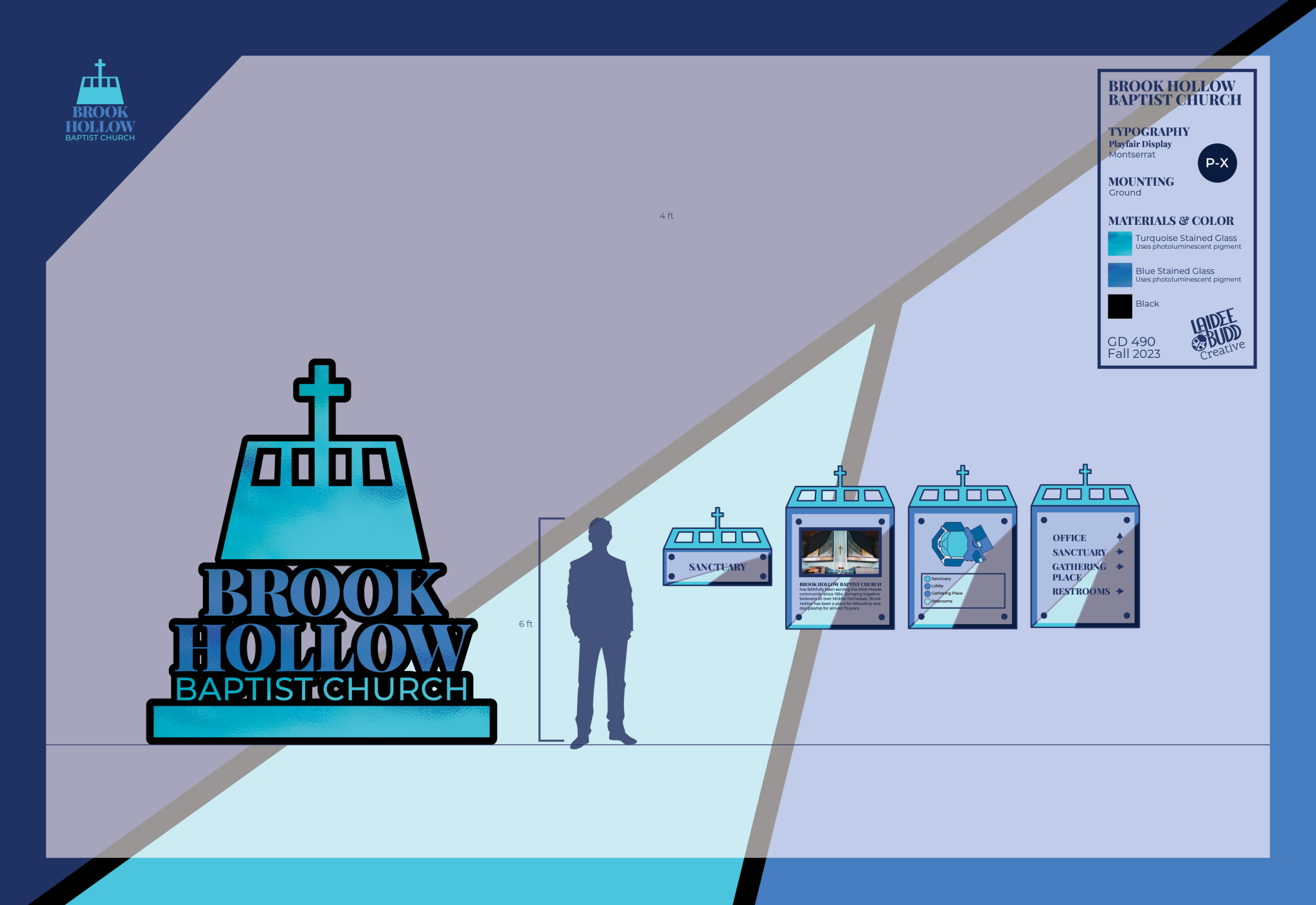
BROOK HOLLOW

REBRAND & SIGNAGE SYSTEM

A clear and structured identity developed to improve visibility, consistency, and navigation across physical spaces.

The rebrand focuses on creating a cohesive identity that translates effectively across signage and environmental applications, ensuring clarity and consistency throughout the space.

Brand Identity, Environmental Graphic Design

brook hollow signage packet mockup

SYSTEM OVERVIEW

The identity is built as a structured system using typography, color, and pattern to create consistency across every application. Each element is designed to function independently while contributing to a cohesive whole.

LOGO SUITE

Brook Hollow Main Logo Brook Hollow Black & White Logo

COLOR PALETTE

PRIMARY

SECONDARY

SECONDARY

NEUTRAL

TYPOGRAPHY

Typography example with placeholder text

Playfair Display is used for headlines and subheads. Montserrat is used for body copy and captions.

WAYFINDING & SIGNAGE

brook hollow signage suite

The system prioritizes clarity and legibility, using hierarchy and layout to guide users through the space. Signage is designed to be easily understood at a distance while maintaining consistency across all touchpoints.

APPLICATIONS

The identity extends across signage, printed materials, and supporting elements, ensuring a unified presence throughout the environment.

SIGNAGE PACKET

DIRECTIONAL SIGN

CONFIRMATION SIGN

INFORMATIONAL SIGN