BANDWAGON
BRAND IDENTITY SYSTEM
A cohesive brand identity designed for a family-owned business, applied across signage, print, and environmental applications to create a consistent and approachable presence.
Brand Identity, Typography, Web Design

A cohesive brand identity designed for a family-owned business, applied across signage, print, and environmental applications to create a consistent and approachable presence.
Brand Identity, Typography, Web Design
The identity is built as a structured system using typography, color, and pattern to create consistency across every application. Each element is designed to function independently while contributing to a cohesive whole.
PRIMARY
SECONDARY
SECONDARY
SECONDARY
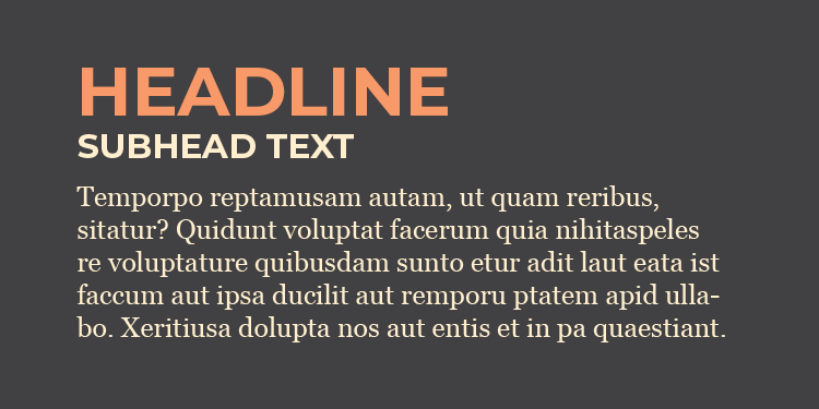
Montserrat Bold is used for headlines and subheads. Body copy and captions use Georgia.

The identity is designed to function in active, real-world environments, maintaining clarity and consistency while supporting a welcoming, family-focused presence.
The identity extends across signage, printed materials, and environmental elements. Each application maintains the same visual language, ensuring the brand remains cohesive in real-world contexts.